Introduction
In Pega applications, standard UI components sometimes require customization to meet specific business needs. This guide walks through the creation of a custom phone number control that displays the corresponding country flag alongside the entered phone number. By following this step-by-step approach, you can seamlessly integrate a customized component into your Pega environment.
Steps to Develop and Publish the Custom Component
1. Set Up the Environment
Create a dedicated folder to store the custom components: For instance, > mkdir C:\CustComponents
Choose the appropriate Component Builder for your Pega version
- > npx @pega/custom-dx-components@2 init (for Pega 8.7 & 8.8)
- > npx @pega/custom-dx-components@~24.1 init (for Pega 24.1)
- > npx @pega/custom-dx-components@~24.2 init (for Pega 24.2)
Purpose: This command initializes the project with the necessary files and configurations to start developing custom UI components.
2. Provide Project Details
Fill in the required information when prompted:
- Enter Project name: NTApp
- Enter Organization name: NT
- Version: 1.0.0
- Description: NTApp contains custom DX components
- Git repository url (optional)
- Author: Novitates
Navigate into the project directory:
> cd NTApp
3. Verify Project Files
Ensure the following files and directories are present:
- package.json (scripts and dependencies)
- src/components/ (stores all components)
- index.tsx (renders the component)
- config.json (defines configuration options for App Studio)
- tasks.config.json (links component to Pega Infinity Server)
- styles.json (defines styles for the component)
4. Develop the Custom Component
Run the following command to create the component:
> npm run create
Provide the following details:
- Enter Component name(required): PhoneNumberWithFlag
- Enter Component labe for displayl(required): Phone Number with Flag
- Enter Component version: 0.0.1
- Enter Library name(required) generic
- Please enter the application names to be supported (comma-separated). Keep empty for all applications.
- Enter type of component : Field
- Enter subtype of component : Phone
- Enter description for the component:custom phone number control with corresponding country flag.
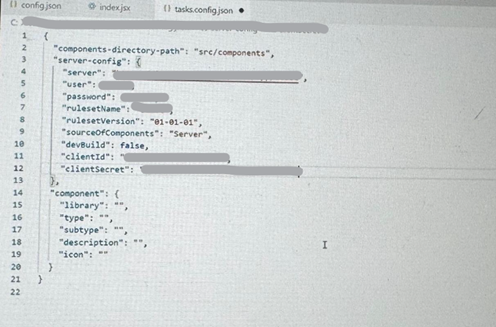
5. Modify Configuration Files
- Update C:\CustComponents\NTApp\src\components\NT_generic_PhoneNumberWithFlag\config.json and edit it for any changes in the configurations required in new custom component.
- Update index.tsx to add code required to show flag against entered phone number.
- Update tasks.config.json with authentication details using OAuth 2.0 credentials from DX-CustomComponents. Fill all the details shown in below screenshot.

6. Test the component
View the demo of the component in Storybook by running the following command:
> npm run startStorybook
This command launches a local preview in Storybook for UI validation.
7. Authenticate with Pega Server
Run the following command to connect to your development environment. A Pega login screen appears in a browser window. Enter your operator ID and password, and click Log in.If the credentials are valid, an authentication success message is displayed.
> npm run authenticate
8. Publish the Component to Pega Server
Run the following command to deploy your Constellation Digital Experience (DX) components to the Pega Infinity™ server to ensure they are available in the component palette during UI development. This enables you to easily access and incorporate them while building your application’s interface.
> npm run publish
After successful deployment, verify the component in Rule-UI-Component class instances.
How to Use the Customized Component in Pega
- In App Studio, add a phone-type property to a view.
- Open Configuration Options.
- Under Display Only, select NT_generic_PhoneNumberWithFlag.
Component Naming Convention
Components should follow the naming convention:
{Organization}_{Library}_{ComponentName}
Example: NT_generic_PhoneNumberWithFlag
References
- Initializing Project in Pega 24.2
- Initializing Project in Pega 8.7
- Constellation UI Gallery
- Custom Components for Pega Platform
- Constellation DX Components – Full Guide
- GitHub Repository for Pega Constellation UI Gallery
Conclusion
By following this guide, you can develop and integrate custom UI components in Pega applications efficiently. This structured approach ensures seamless customization while maintaining compatibility with Pega’s Constellation UI framework. Implementing custom components enhances the user experience by tailoring Pega applications to specific business needs.
Author
Priyanka Aavula
Associate Architect
Novitates