Introduction
As part of Pega Constellation development, most of the time, we are advised to use Pega OOTB UI components, for which localization can be configured with minimal effort.
However, for a few advanced or custom UI requirements that are not available or suitable in OOTB, we can implement Custom DX components. In such cases, localization of the component content is not applied automatically.
In this article, we will explore a couple of component types, their elements, and how localization can be implemented for them.
Important Note
The content in this article is based on self-exploration and is intended for demonstration purposes only. It may include areas that are yet to be explored in detail. We do not recommend using custom components in your application unless it is business-critical and no OOTB alternatives exist. It is always advisable to involve a seasoned UI developer when implementing a PROD-ready component, following Pega OOTB style guidelines and guardrails.
We have used VS Code editor to create the Custom DX Component and publish it to Infinity accordingly (not going into detail about how to create and publish a component). If you want to start from there, please refer to the Novinsights links below:
https://novitatestech.com/customizing-pega-ui-building-a-tailored-component/
Component Type : Field
Set Up Component
Let’s take a simple example of creating a Field (Type) → Text Input (Subtype) component that contains a simple Text Input and a custom label rendered as part of the component.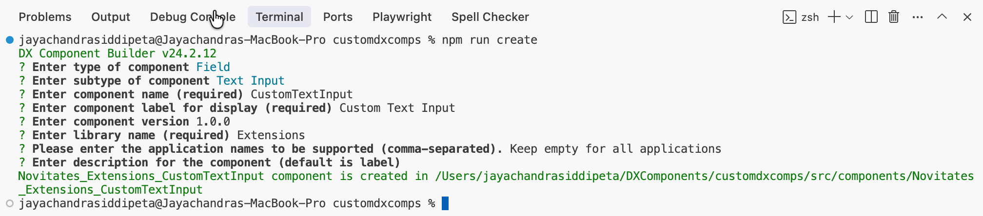
We created a boilerplate component and added a Text Input and a simple Text field for demonstration purposes.
Please note that this component will get all values to be rendered from config.json as parameters when we use it in a Pega view. This is very important, and we will discuss it further.
Below is how this component renders on the UI when tested with Storybook.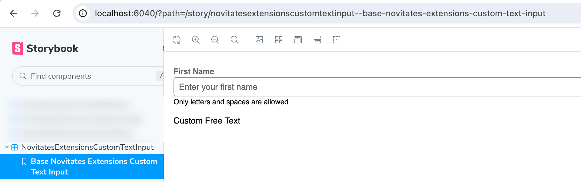
For customization purposes, I added some background color and font color to the Text Input element. This will not show up in the final rendering.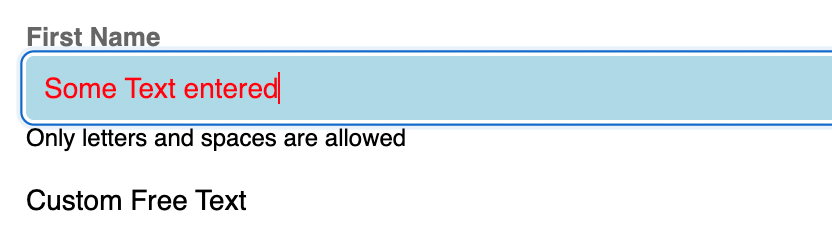
Localization Setup
Moving on to localization, we need to create a new file named localizations.json in our project and set up all the localized content as shown below.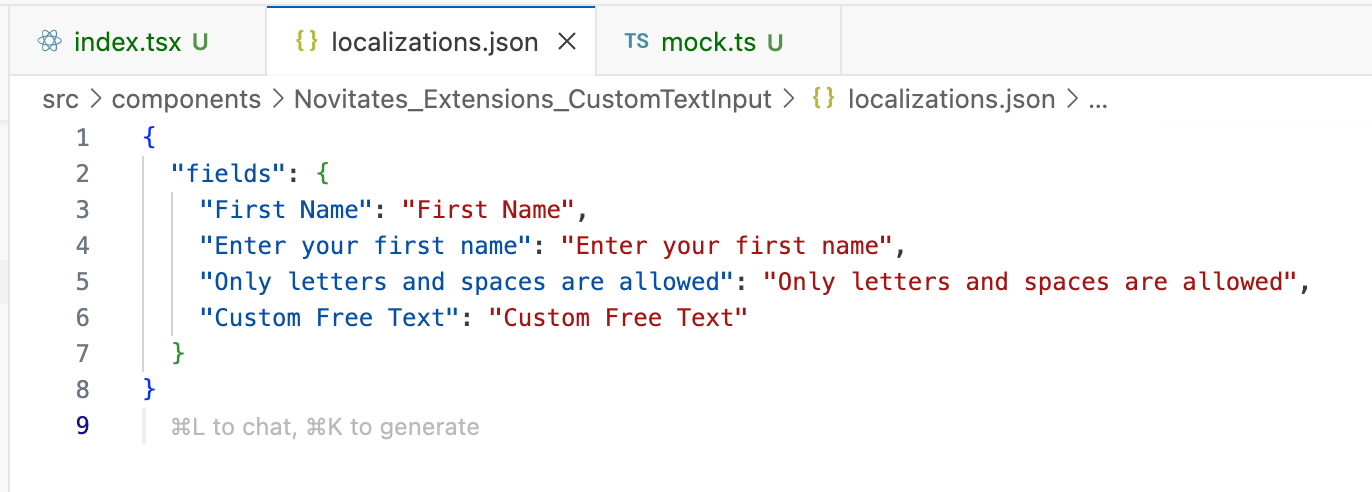
We cannot test localized content in Storybook; it must be done in Pega Infinity itself. Save the project files, authenticate to Pega Infinity, and then publish the component.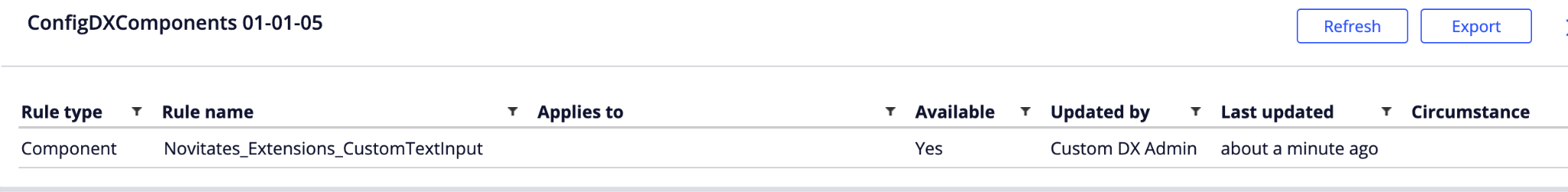
Usage in Pega
Once the component is published and the Rule-UI-Component rule is created, let’s start using this component in one of our views in a case type.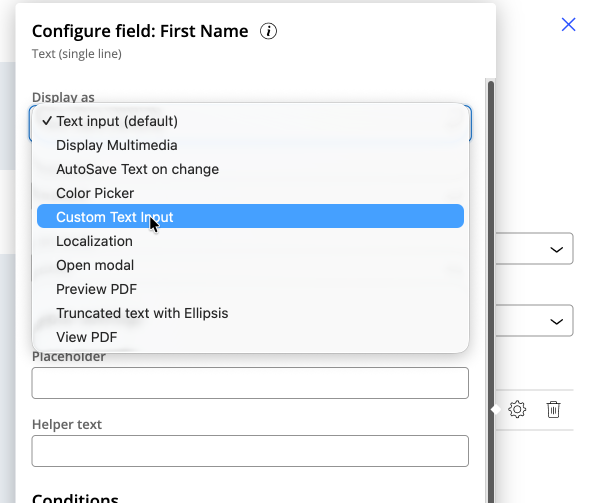
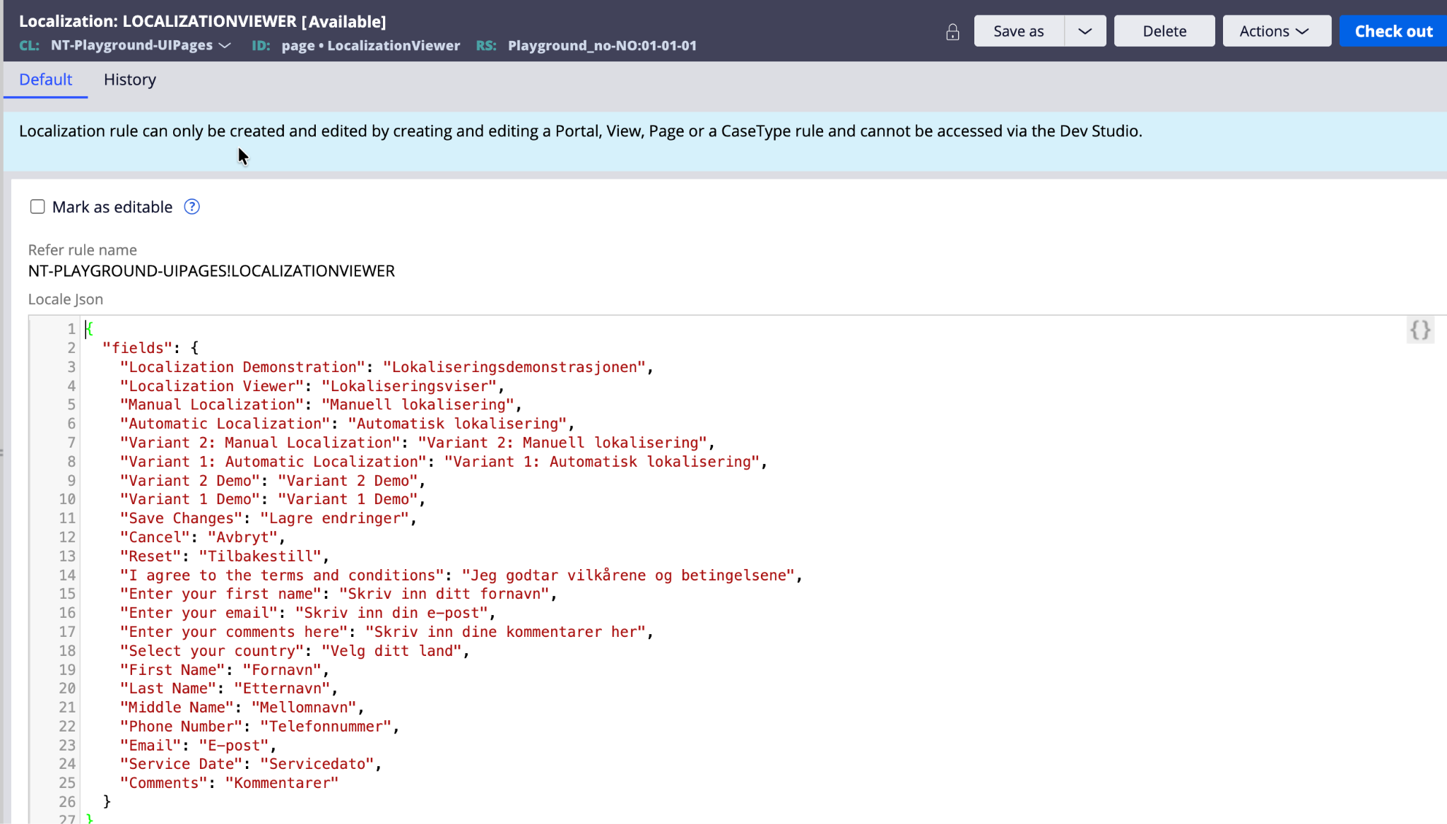
Enter all the parameters corresponding to the field labels set up in the localizations.json file. Once this step is done, you will notice that Pega reads the localizations.json file content related to your component and loads it into the Localization rule specific to this view (it creates automatically if it does not exist). Below is how you can verify it.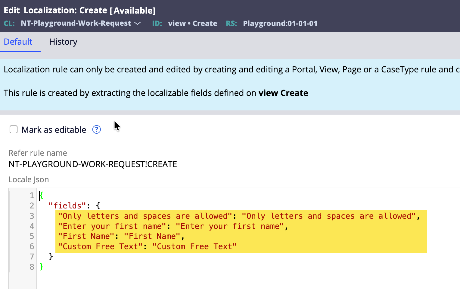
Create the case and verify that the component loads properly, as shown in the preview of the view rules.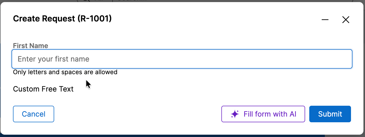
Generally, localization should be configured once all development of the screen/module/application is completed, in order to avoid rework of updating localized content multiple times.
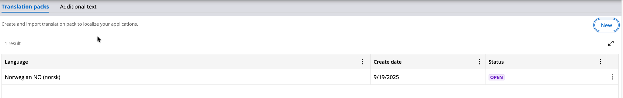
Run Localization Wizard
Execute the localization wizard from App Studio for your desired language. In this article, we use Norwegian as our translated language. For now, I am not using Localize with GenAI.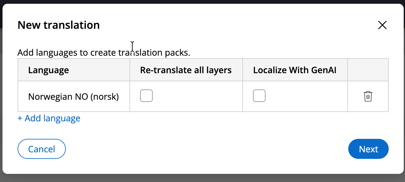
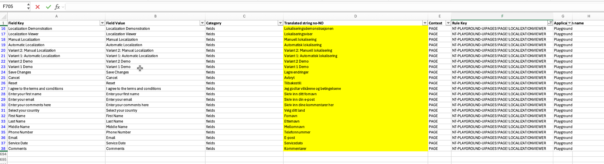
Download the translation pack and update the localized content in the appropriate fields as shown below.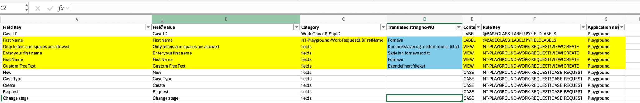
Upload the zipped content to Pega again.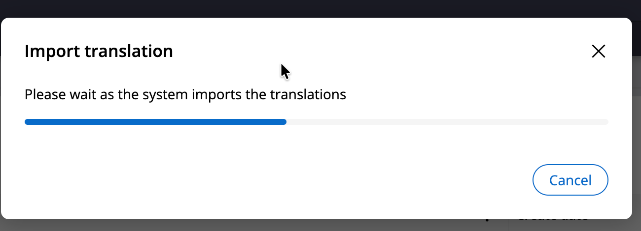
You will notice that Pega automatically created the no-NO ruleset and populated the content accordingly.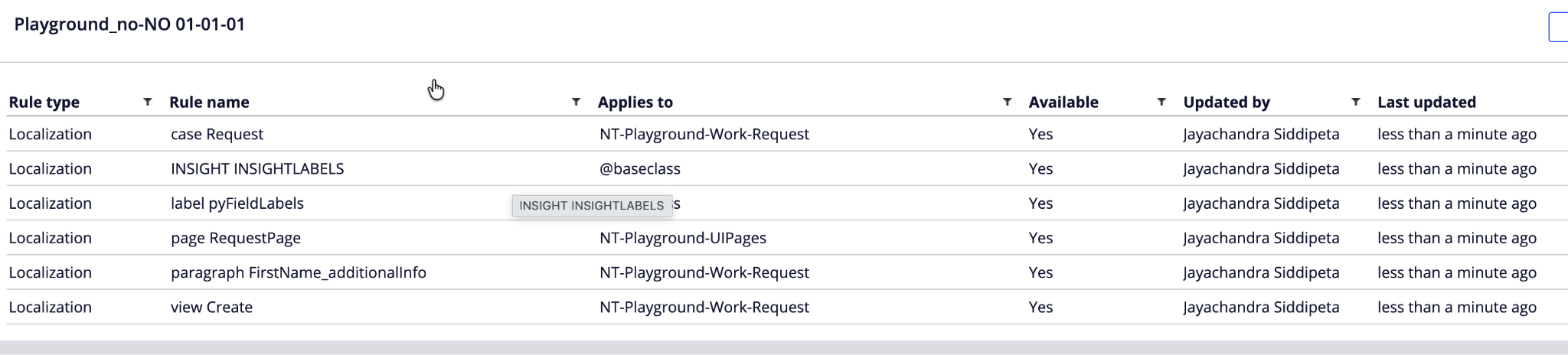
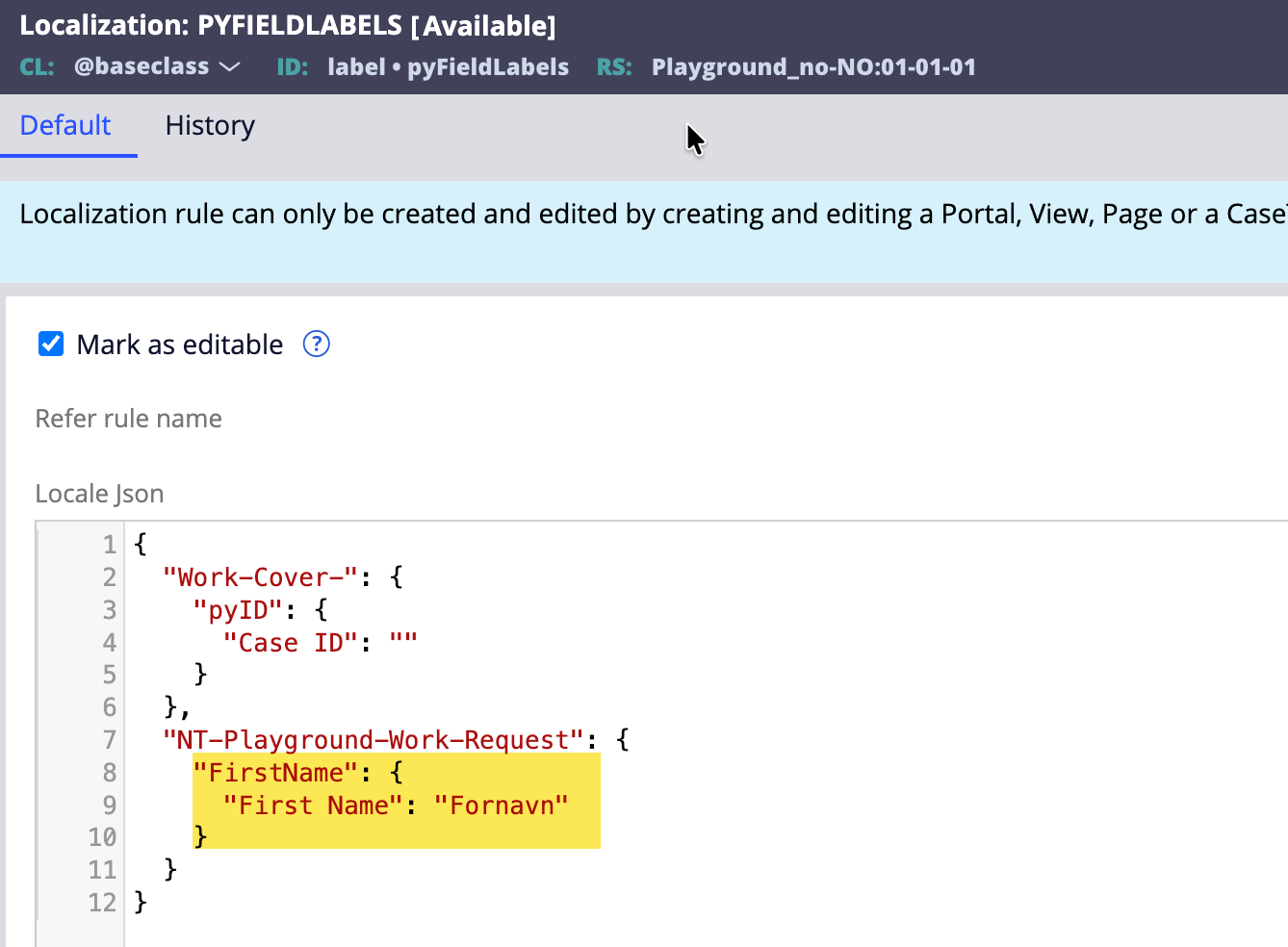
We can see that our Localization rule for the view has been loaded with localized content. Additionally, an entry was also added to the @baseclass pyFieldLabels Localization rule. (The purpose of that is still unclear.)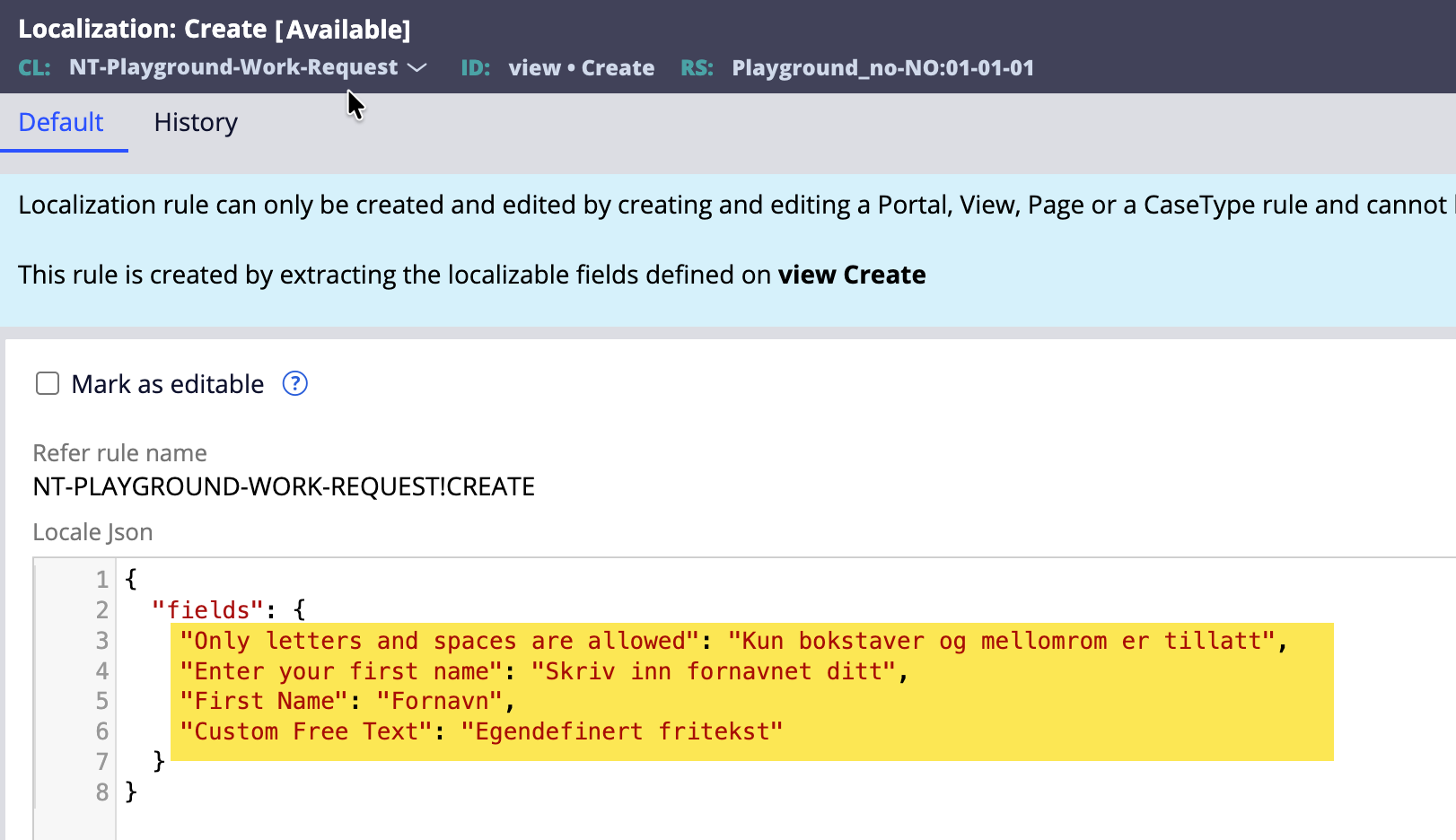
Change the operator locale and verify the changes on the case. Below is the snapshot you will see once you create the case. Notice that the Text Input content displays localized content, but the free text label still shows English content despite localized content being set up in the Localization rule.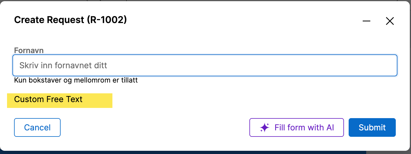
Now, remember the point I mentioned earlier about parameters. Since the Text Input is rendered based on input parameters provided to the component, the content is already localized and sent to the UI for rendering.
On the other hand, the custom free text was just a simple <Text> tag, which Pega does not consider unless we do something special.
Crucial Component Changes
This is where PConn and PCore APIs come to the rescue. We need to call these API methods, pass the relevant parameters, fetch the localized content, and render it in the component.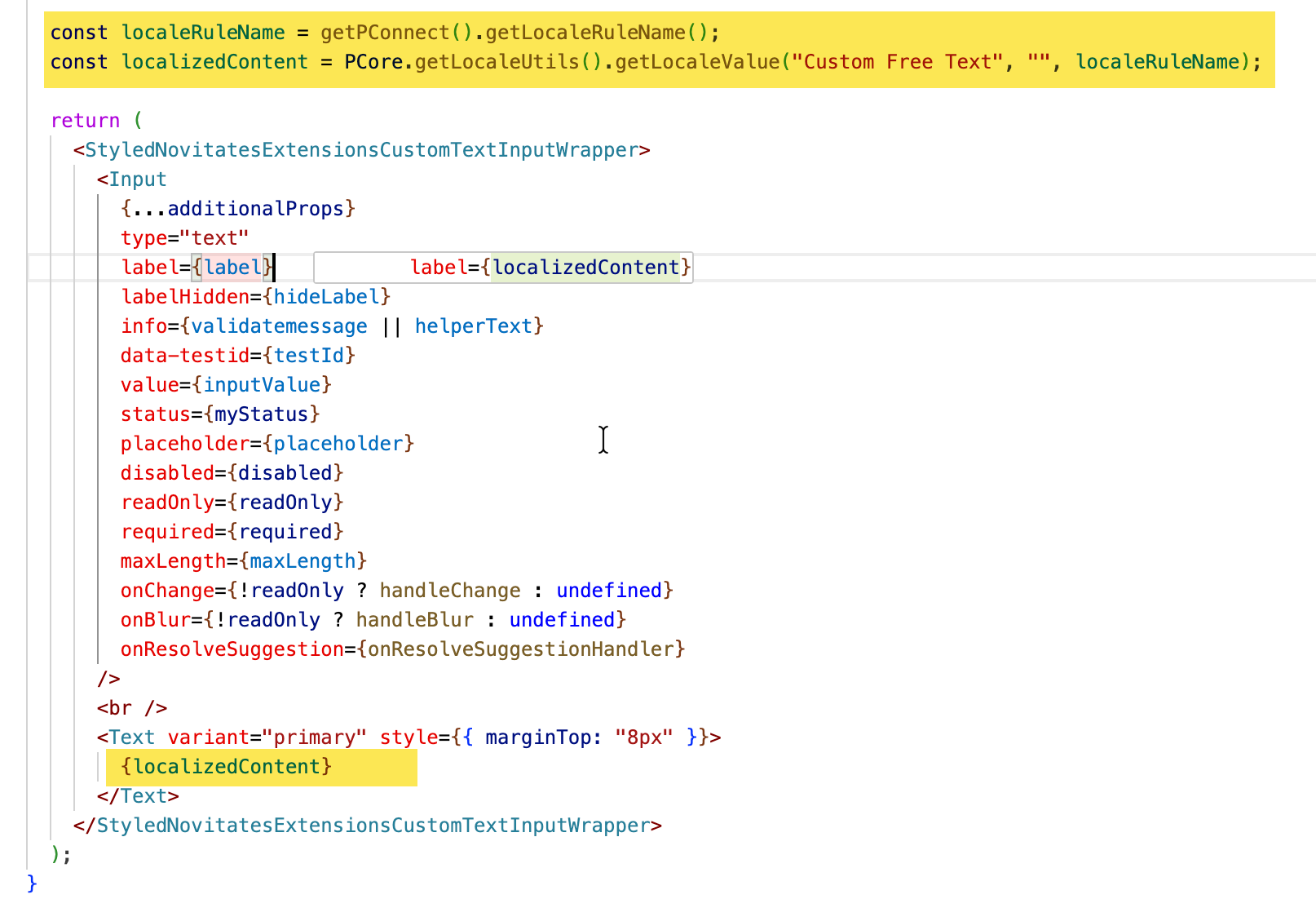
First, we fetched the LocaleRuleName using the PConn method and then used it to fetch the localized content using the PCore method.
Notice that nothing needs to be hardcoded other than the label to fetch the localized content. Once the above changes are made in the component, publish it to Pega for testing.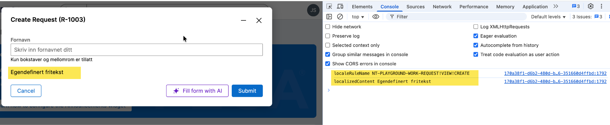
Now you will see that the localized content for free text also displays on the UI. The console also logs the debug information we set up in the component.
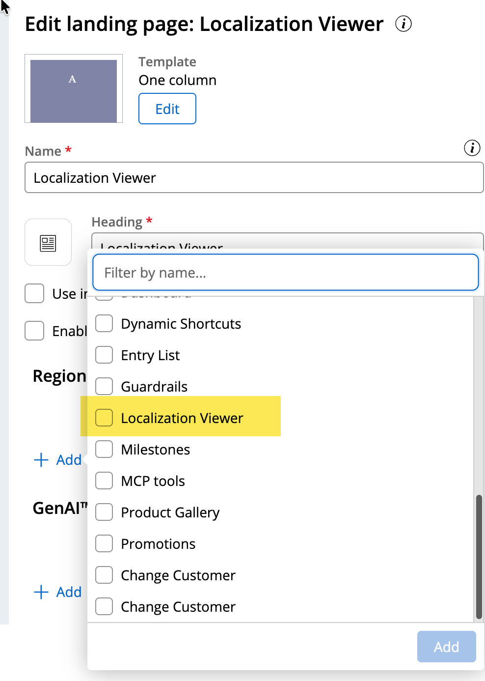
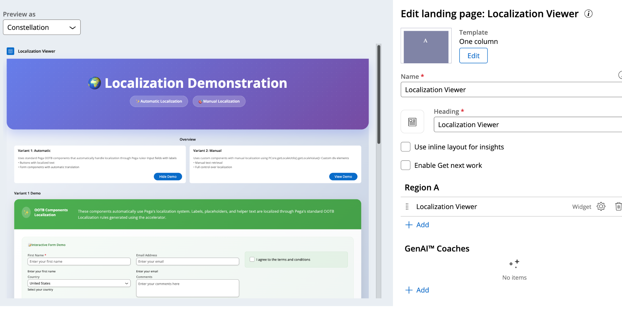
Component Type: Widget
If we create a component of type Widget and want to localize the content, the steps are mostly the same as above, but the views created in Pega will be slightly different. Below are the snapshots.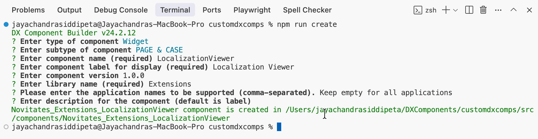
I created a widget called LocalizationViewer to demonstrate this. I included the widget in a separate landing page, as shown below.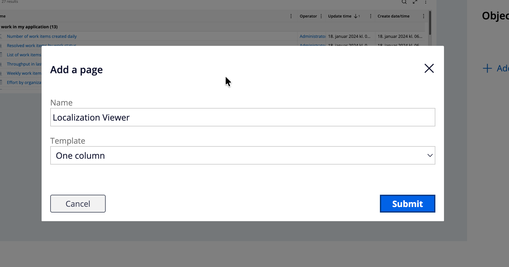
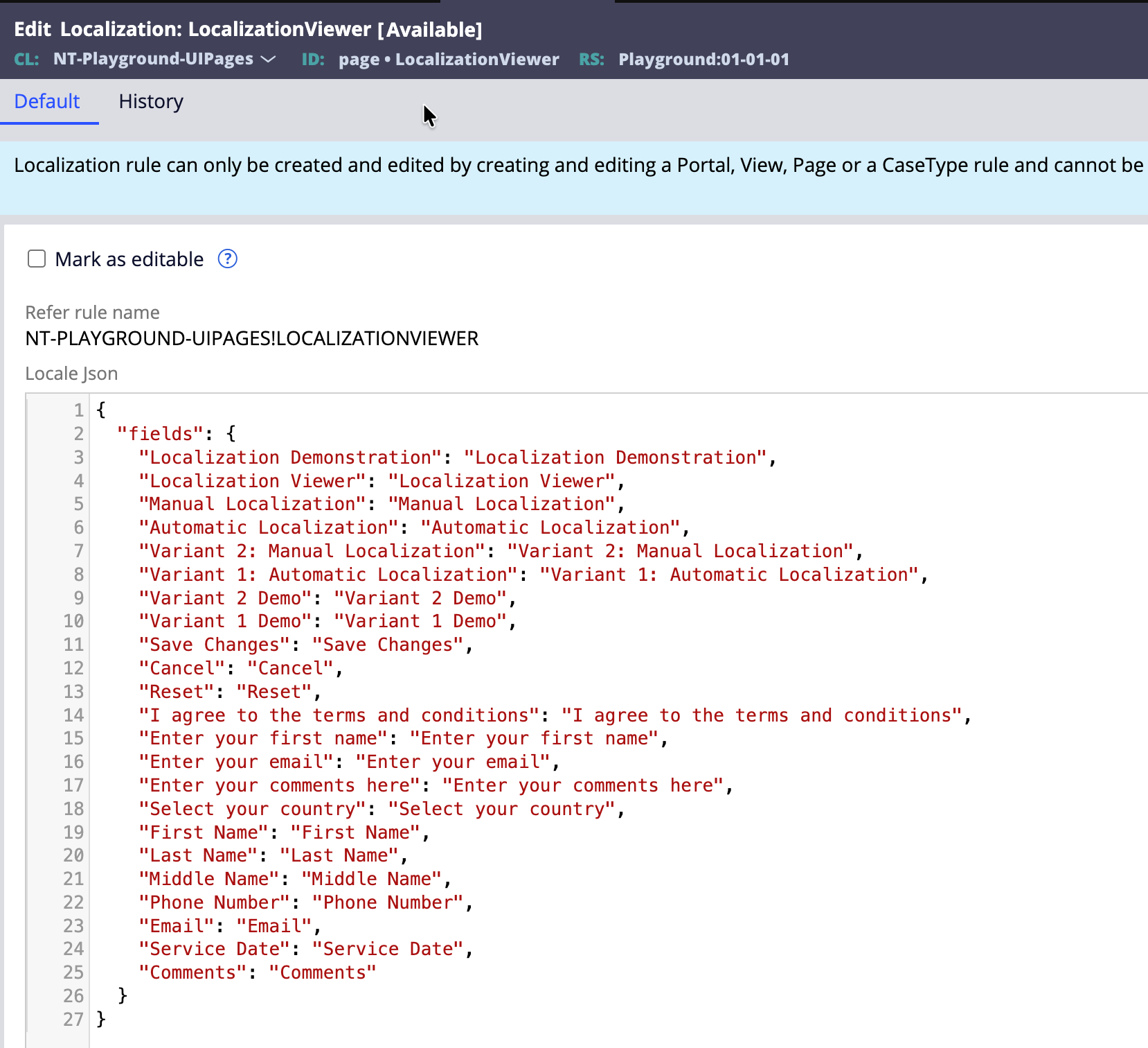
You will notice that once the landing page is loaded with the widget, Pega creates a Localization rule with context as Page and loads all the localizations.json content into it.
Export the localization pack again, and this time I used GenAI to populate the localized content automatically in the Excel file.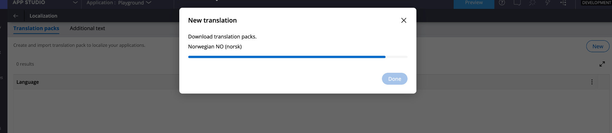
Import it back into Pega and verify the updated Localization rules as shown below.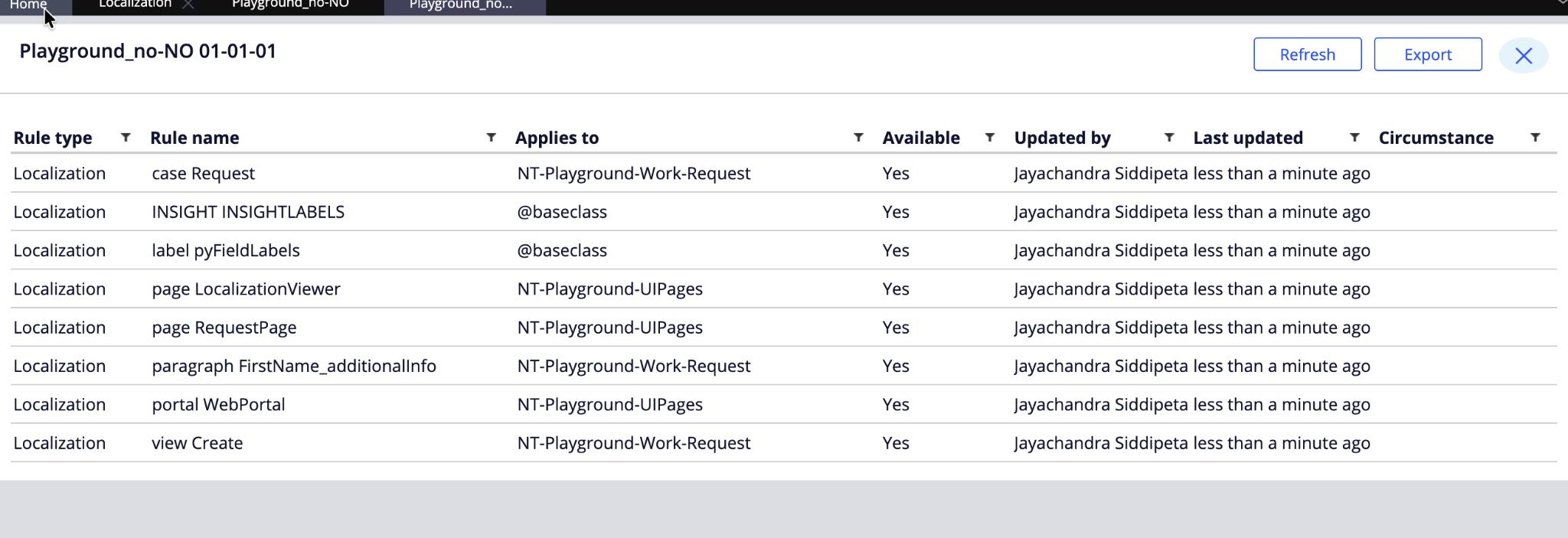
Important Note
For all free text content you configure or generate in your component, you need to write a utility function to fetch the localeRuleName and then use it to get the localized content, as shown below: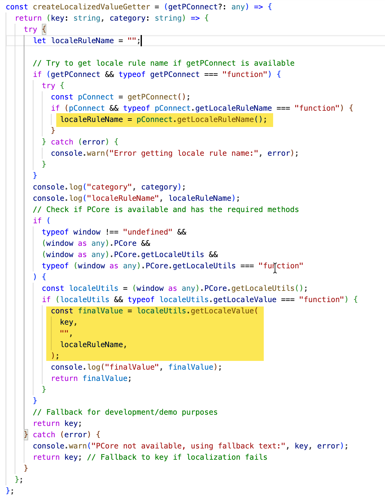
Use this method to get the localized content wherever necessary. Ignore the second parameter which i did not cleanup
const getLocalizedValue = createLocalizedValueGetter(getPConnect);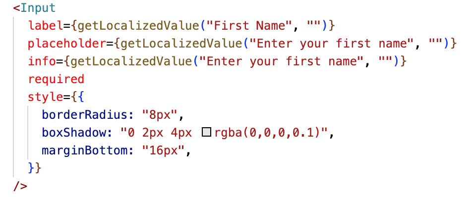
As the <input> tag does not take its value from component parameters, you must explicitly provide the fetched localized content to it for rendering on the UI.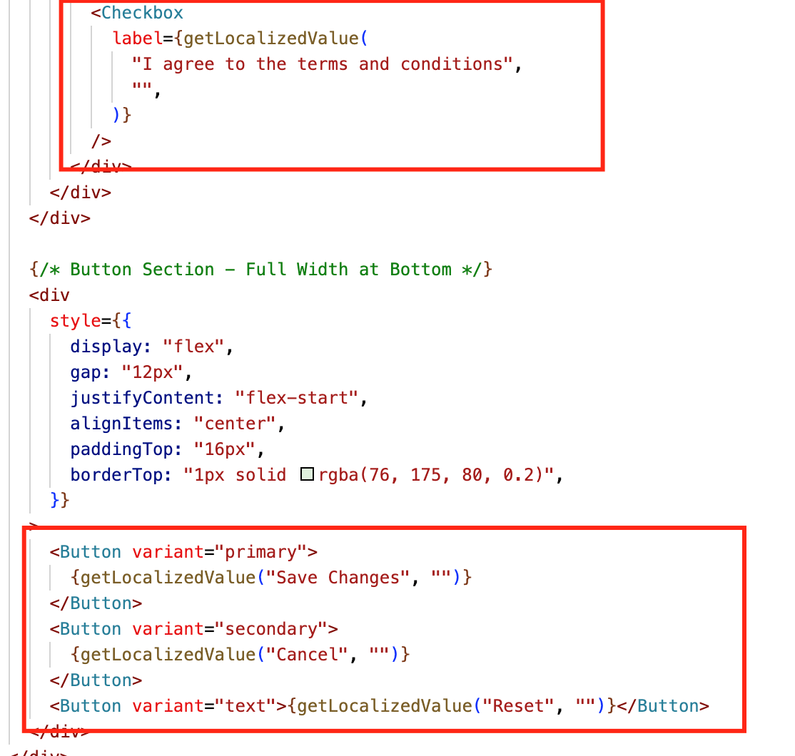
Code Snippets for Reference
const localeRuleName =
getPConnect().getLocaleRuleName(); // you will get “WORK-HOME!VIEW!PERSONALINFO”
Then use the below PCore/PConn method to fetch the localized content,
const localizedContent =
PCore.getLocaleUtils().getLocaleValue(“Sample Content”, “”, localeRuleName);
(or)
const localizedContent =
getPConnect().getLocalizedValue(“Sample Content”, “”, localeRuleName);
Conclusion
With the above setup, you can successfully localize all the content rendered as part of your custom component. Any future changes in the localized content can be managed from Pega’s Localization rule using the wizard, and you do not need to make any changes to the component. For any new fields or elements added as part of the component, the same process should be followed again to ensure the Localization content is updated.