While Pega Constellation offers a powerful, model-driven UI framework with a growing suite of components, there are times when specific business needs or user experience expectations call for something more tailored. In such cases, custom DX components can help bridge that gap—especially when your team includes seasoned React developers who are comfortable building modular, reusable UI pieces.
In this article, I’ll walk through two such custom components we’ve built to enhance our Pega Constellation implementation:
- A Milestone Tracker
- A Hierarchical Multi-Select Dropdown
These components were born not out of necessity, but from opportunity—instances where the standard UI controls either didn’t match the UX patterns we wanted or couldn’t scale to more complex interaction needs. Both were designed with extensibility and maintainability in mind, adhering closely to Pega’s DX APIs and best practices.
Why Build Custom Components?
There’s often a misconception that custom components are a sign of platform gaps or workarounds. That’s not the case here. Pega’s DX architecture provides a well-defined way to extend the UI layer safely. We didn’t set out to “replace” anything—but rather to augment the experience for cases where richer interactions are beneficial.
Take, for instance:
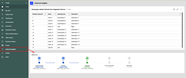
- A milestone tracker, much like the delivery status bar you see on e-commerce platforms, which visually maps the stages of a case or transaction. Agreed that we do have Timeline component provided OOTB, however this one’s a bit simpler and colourful.
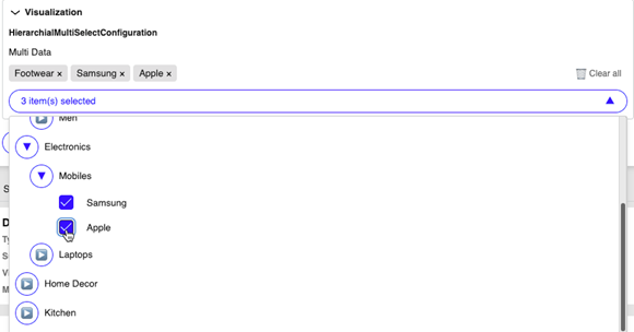
- A hierarchical multiselect, essential when users need to select values from multi-level categories (e.g., region > country > state > city) with parent-child relationships and leaf-only selection.
These were less about customization for the sake of it, and more about providing intuitive, frictionless experiences where it mattered.
The Components
- Milestone Tracker
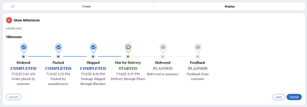
This component was inspired by modern delivery trackers used in apps like Amazon or Swiggy. Each milestone stage is represented horizontally, with current status highlighted and completed stages marked with animations and visual cues.
Key highlights:
- Fully responsive layout web page, tablet and mobile.
- Status driven purely by data—ideal for mapping to case statuses or SLA checkpoints.
- Minimal dependency footprint and fully React-compatible.
- Easily extendable for both vertical and horizontal layouts.
We ensured this component was driven entirely by a data page so that it remains model-compatible and scalable. More varieties of display trackers to come in future.

- Hierarchical Multi-Select
This component enables users to select multiple values from a deeply nested structure. It supports dynamic loading of children, custom labels, and can be configured to allow only leaf node selection.
Where it fits:
- Product categorization
- Region and sub-region selectors
- Department and role trees
Highlights:
- Lazy loading for performance.
- Search text box for filtering the options and clear all button.
- Visual indentation and parent-child link preservation.
- Can map directly to a Pega Page List – We are not yet there as we are still working on this part. For now we will get the selection options as a comma-separated string of pyGUID’s.
In building this, we made sure the hierarchy could be easily updated via a Data Type ensuring low-maintenance and dynamic configurability.

Best Practices Followed
Building React components for Pega Constellation isn’t just about rendering JSX—it’s about respecting the design-time and runtime models Constellation expects. Some key practices we followed:
- Field-compatibility: These are implemented as field-level components, making them pluggable into sections or views without needing layout-level customization.
- Read-only and editable modes: Every component respects read-only, disabled, and validation states.
- Styling consistency: We tried to align styles with Pega’s design tokens and class structure for a native look-and-feel. Still not close to what Pega has given OOTB.
- Minimal dependencies: We avoided heavy libraries, relying instead on lightweight utility methods to keep the bundle size small.
- Extensibility hooks: Both components are designed to allow internal configuration overrides and can be versioned easily.
- Backward compatibility for Theme–Cosmos : We have built the same as a control for it work for UI-Kit and Theme-Cosmos as well.

Inspiration & Mindset
The motivation behind these components was simple: UI should not become a limitation when your team has the skillset to do more. We didn’t try to build a parallel UI stack—but rather stayed within the Constellation DX model while giving our users (and developers) richer UI capabilities when the use case demanded.
There are still many things which have to be taken care while building a custom component like Localization, Accessibility, etc which Pega does while building the OOTB components.
We see this not as a challenge to the platform, but as a way to get the best of both worlds—model-driven speed + developer flexibility.
You don’t need to reinvent the wheel—but it helps to know how it’s built, in case you ever need to build a better one.
See It in Action in Converse App
https://rcjwaijr.pegace.net/prweb/PRAuth/app/converse
ConverseGuest/rules#2025
Feel free to explore, adapt, or draw inspiration from them. You may never need to write such components—but if you do, it’s good to know that the architecture allows you to do it right.
Final Thoughts
Pega Constellation is evolving rapidly, and its native components are increasingly robust. Still, every implementation has edge cases—and in teams with strong frontend talent, custom DX components can serve as a powerful bridge between the model and the user. Feel free to drop your thoughts and comments.
The key takeaway? Use them wisely, build them well, and make them maintainable.